pacman::p_load('plotly', 'tidyverse', 'ggHoriPlot', 'ggthemes')
#tidyverse covers lubridate, dplyr, tidyr alreadyHands-on Exercise 7b
7b. Time on the Horizon: ggHoriPlot methods
7.1 Overview
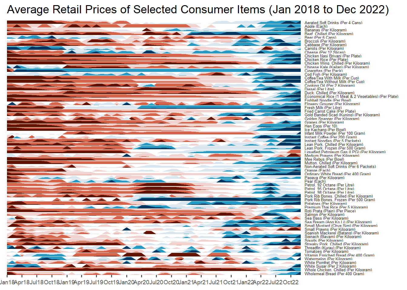
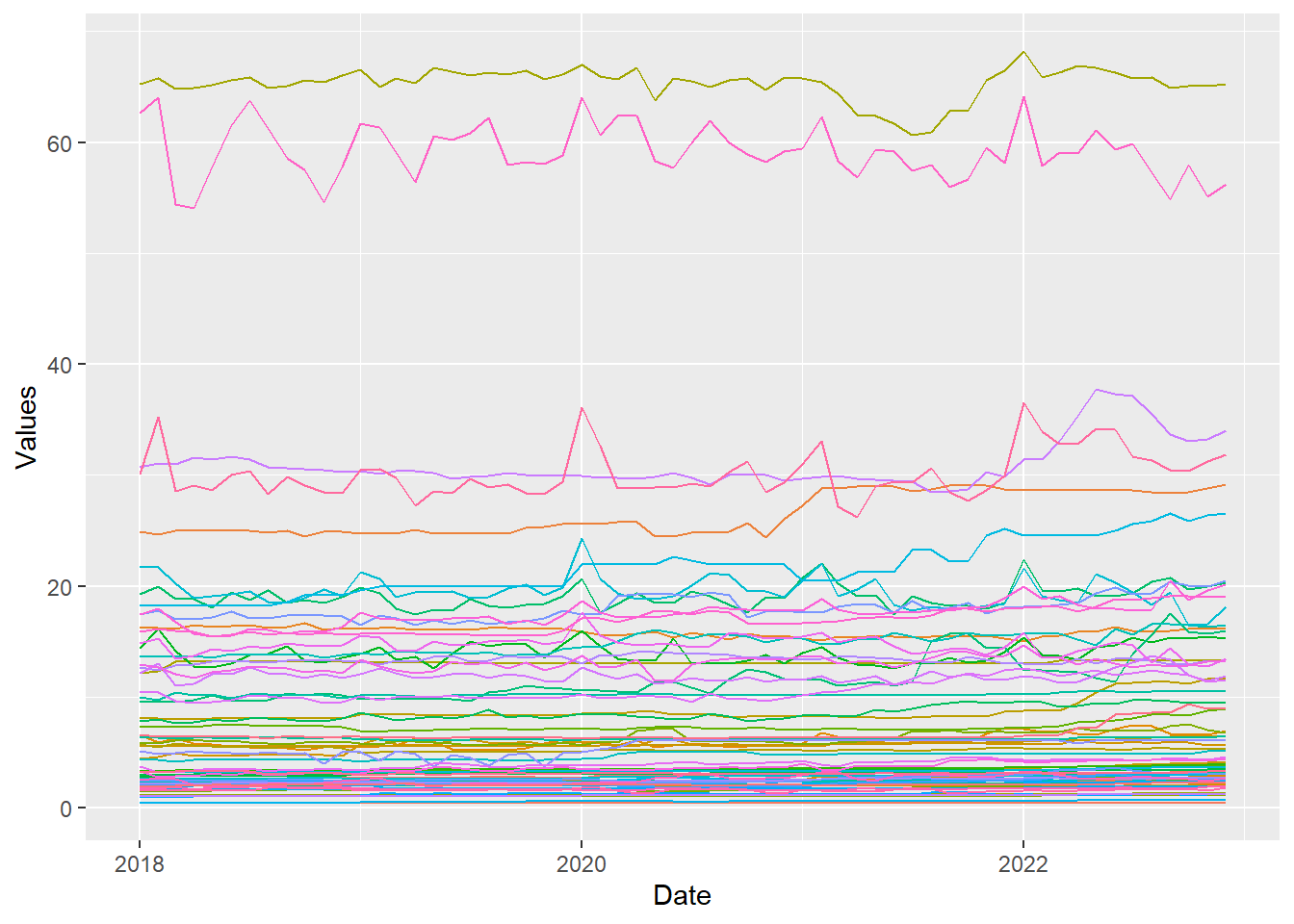
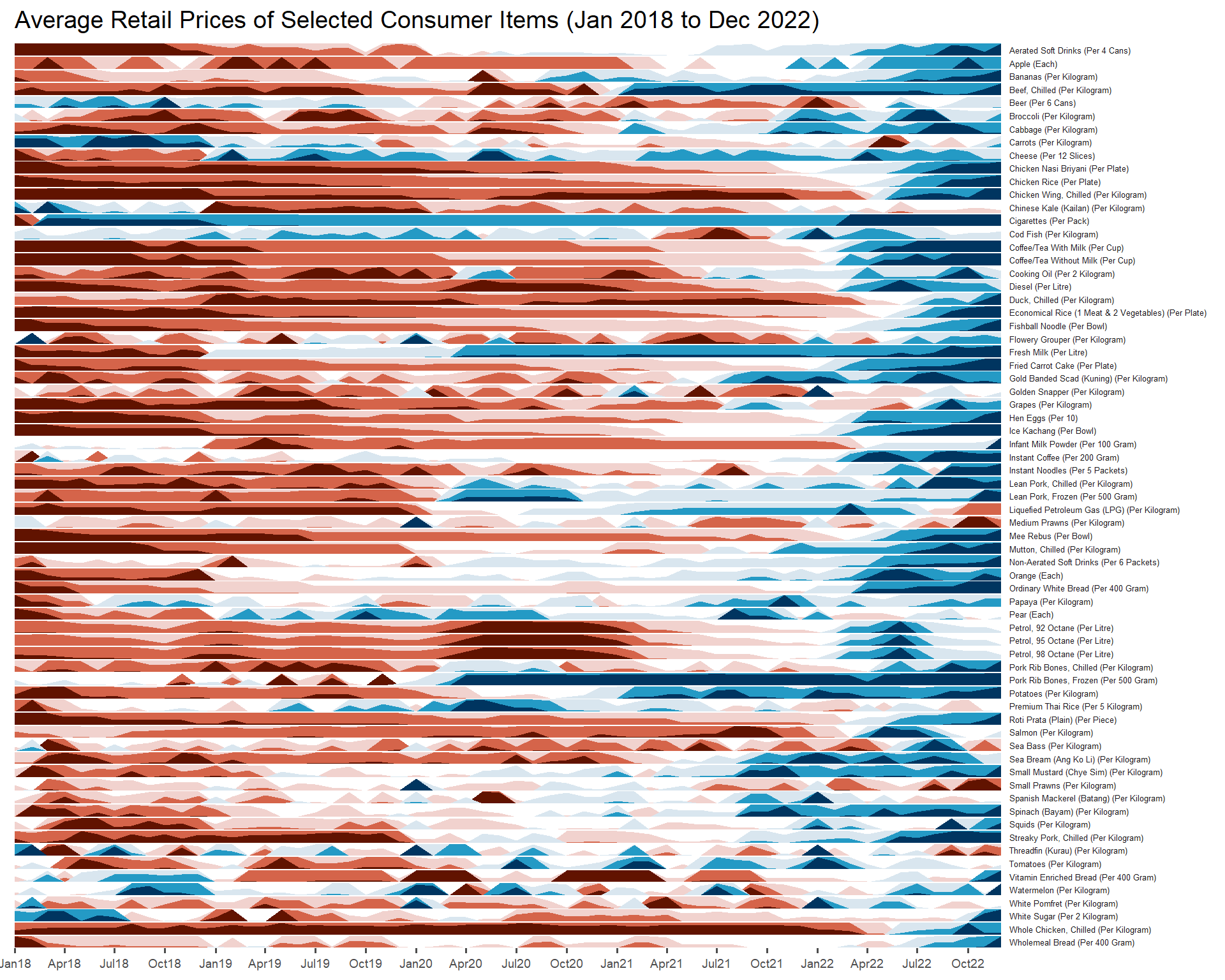
A horizon graph is an analytical graphical method specially designed for visualising large numbers of time-series. It aims to overcome the issue of visualising highly overlapping time-series as shown in the figure below.
A horizon graph essentially an area chart that has been split into slices and the slices then layered on top of one another with the areas representing the highest (absolute) values on top. Each slice has a greater intensity of colour based on the absolute value it represents.
7.2 Getting started
Before getting start, we need to make sure that ggHoriPlot is loaded.
7.2 Data Import
For the purpose of this hands-on exercise, Average Retail Prices Of Selected Consumer Items will be used. We use the code chunk below to import the AVERP.csv file into R environment.
averp <- read_csv("data/AVERP.csv") averp <- read_csv("data/AVERP.csv") %>%
mutate(`Date` = dmy(`Date`))7.3 Plotting the horizon graph
Next, the code chunk below will be used to plot the horizon graph.
averp %>%
  filter(Date >= "2018-01-01") %>%
  ggplot() + # still need ggplot as geom_horizon is an extension of ggplot()
  geom_horizon(aes(x = Date, y=Values),
               origin = "midpoint",
               horizonscale = 6)+
  facet_grid(`Consumer Items`~.) + # need to have '' due to the space, ~ refers to function
    theme_few() +
  scale_fill_hcl(palette = 'RdBu') +
  theme(panel.spacing.y=unit(0, "lines"), strip.text.y = element_text(
    size = 5, angle = 0, hjust = 0),
    legend.position = 'none',
    axis.text.y = element_blank(),
    axis.text.x = element_text(size=7),
    axis.title.y = element_blank(),
    axis.title.x = element_blank(),
    axis.ticks.y = element_blank(),
    panel.border = element_blank()
    ) +
    scale_x_date(expand=c(0,0), date_breaks = "3 month", date_labels = "%b%y") + #breakline at 3 months
  ggtitle('Average Retail Prices of Selected Consumer Items (Jan 2018 to Dec 2022)')